Category:Interior

Sherwin-Williams February Color

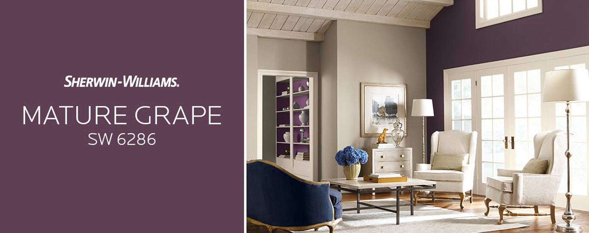
The Sherwin-Williams Color of the Month for February is sure to brighten up your home if you’ve gotten tired of the gray outdoors — because it’s a gorgeous purple paint that’s bringing a fresh look this time.  Sherwin-Williams chose Mature Grape SW6286 this month, and we think it’s great. Here’s a few ideas for how to use it!

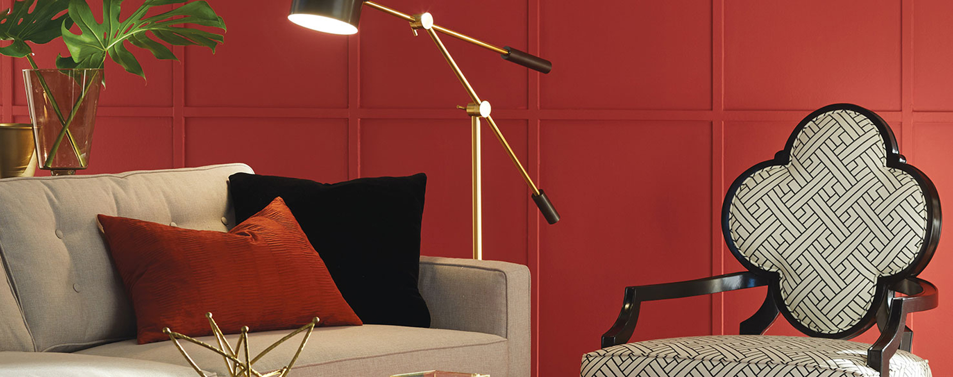
We all know grays and whites have been the rage recently.  And why not?  They’re classy and they go with everything.  What people haven’t been focusing on as much is how much they can bring out an accent color. We love the idea of taking warm, rich, royal colors like purple and using it as an accent wall.  Choosing a color for one wall, and matching it to say a pillow or art piece, can really make all the colors sing — from that purple paint to the gray couch to the white drapes.  You don’t have to stick to just neutrals to have a calm atmosphere. And a royal color like purple could be just the thing to make your living room pop in a really clean, sophisticated way.

But maybe a coat of deep purple paint seems a little too much for your wall?  That’s ok. We also love the idea in the cover photo from Sherwin-Williams, featured above. See the white shelving on the left? Painting the inside and back of the shelves in purple drew the color from the living room into the next room, without painting the walls the same color and overusing the look.

Regardless of whether you choose purple paint, blue paint, gray paint, red paint… there’s always a way to tie dark, or rich, or bright colors into a semi-neutral color scheme. Lots of people are afraid of going for darker or brighter colors because of the risk of being overwhelming.  If you have a color you love but have been afraid to use, give me a call!  I can help you find the perfect way to tie it in to your space.  We’ll make those colors sing yet.


Love, Katie


Ps. Get more purple paint inspiration by watching Sherwin-Williams February Color video HERE.

Paint Sheen – Tips for Your Home Project

Walls don’t stay perfect — but the paint sheen you choose can either hide your walls imperfections or amplify them. “Sheen” refers to the amount of gloss in the paint. It might not sound like much, but it can drastically effect the texture of your wall and the overall effect on your space.  We can help you pick the paint sheen that will best cover whatever your home struggle is, from kids coloring on the walls to bumps and scrapes along the way.
GENERAL RULES OF THUMB.
Though it’s always preferable to get an opinion that’s specifically for your space, there’s always a couple of general tips to live by.
During your preliminary planning, keep these tips in mind:
  • The lighter the color and the more flat a paint sheen you choose, the more it will hide most imperfections. This works great if you are looking to cover up some dents along the way.
  • However, the darker a color is and the the more sheen or glossy paint you choose, the easier it is to wash. We recommend a darker and glossier color for those spaces that get dirty more often — or for where little hands and crayons can reach.
NOT ALL PAINTS ARE CREATED EQUAL.
Some people are afraid to choose a flat paint sheen because of past experience — a low quality, apartment grade flat can have a chalky feel that people tend to avoid. High quality flats (like one of Katie’s favorites, Sherwin-William’s cashmere) isn’t chalky at all, and can prove to be a great asset for certain projects. For example, tall great room walls with direct light shining on them look better in a flat finish that won’t throw too much light around.
FIND A HAPPY MEDIUM. 
Sometimes a high gloss isn’t what you want. Sometimes the idea of a flat isn’t working for you.
Thankfully, there’s always a happy medium.
Eggshell is probably one of the most popular sheens out there (and no, it’s not a color like some people think — you can get any color in an eggshell sheen!) It’s got a healthy, muted gloss that is easier to clean than a flat, but not so much that it’s overly shiny.  Because of it’s versatility, it’s a favorite for those spaces where you really need a little bit of the best of both worlds.

Sherwin-Williams January Color of the Month

January always holds a little extra calm for me.  It’s like a deep breath – after the holidays, after the family gatherings, after the cleanup.  A lot of good has happened, and now there’s a fresh clean year in front of you. And you finally sit and relax and think about that.

How’s it looking from where you’re sitting now?

Color is my thing, so I think it’s important – but I’m not the only one, because even psychologically, color changes your mood and your view.  January is the perfect time to freshen up your walls inside — and if you’re wondering what color will go with that restful feeling and the cup of cocoa in your hand, Sherwin Williams might have an answer.

They just released their Color of the Month for January: SW6039 Poised Taupe. They liked it so much it’s also the Color of the Year. I hope I can describe my 2017 as “poised,” but regardless, it’s definitely a good description of this earthy, cool tone taupe. It’s got enough purple undertones to give it a classy look that pairs well with silver, but it keeps enough warmth to bring out wood tones and sunshine.

Taupe does vary in tone depending on the light, so if you’re loving this color but aren’t sure what it would look like in your space, give me a call!  Maybe painting isn’t your thing – that’s ok. We’re here to make your life easier, and still give you the paint makeover you’ve been dreaming of.

2017 is looking poised and classy already.

Love,

Katie


P.s. See more inspiration in Poised Taupe at Sherwin-Williams!

Sherwin-Williams December Color of the Month

It’s the most wonderful time of the year! Nothing brings you back to home like Christmas does, but the new Sherwin-Williams color of the month for December might add that extra sparkle.

Silverplate SW 7649 is a perfect light gray – not too cold, not too vague – just the right amount of elegance. We think it’s perfect for an unassuming sophisticated look. Like you look great, but not like you’re not trying too hard (which is exactly how we all try to look when the extended family comes over, right?)

Check out the newest pictures of rooms styled with Silverplate from Sherwin-Williams here. We have to admit gray has been one of the most popular colors this year, but no matter what color you think is the perfect backdrop for your life, we know we can help you make your space exactly what you dream it should be. And no, we won’t tell if a new paint job is your Christmas gift to yourself.


Share:
Profiles: